
Most AI image generators produce images. Fewer produce images that are ready to put in front of an audience. There’s a meaningful difference: presentation-ready visuals need to be clear under pressure, legible at distance, consistent with a brand, and structured enough that they communicate a message rather than just look nice.
That’s the problem this article addresses. Not “what can Nano Banana 3 generate?” but “what can it generate that’s actually useful for presentations, proposals, internal decks, sales materials, and team-facing content?”
Pollo AI has become a practical access point for teams who want to test these capabilities without navigating complex tooling. The observations here come from real use cases—and they’re organized around what actually works when the goal is a presentation-ready output, not just an impressive generation.
Why Presentation-Ready Visuals Need More Than Pretty Images
Visual quality is table stakes. The harder requirements for presentation-ready content are structural:
- Readable text at multiple sizes. A visual that works as a full-screen slide may also need to hold up in a PDF, a printed handout, or a thumbnail preview on a stakeholder’s email preview pane.
- Clear visual hierarchy. Presentations communicate in real time. A viewer can’t stop and parse a cluttered diagram mid-conversation. The most important element needs to dominate immediately.
- Brand consistency across assets. A pitch deck that mixes two visual styles signals a lack of cohesion. A marketing presentation where every slide looks like it came from a different campaign is harder to trust.
- Functional composition. Text that flows off the edge, labels that overlap, or elements positioned without spatial logic aren’t just aesthetically weak—they break the communication function.
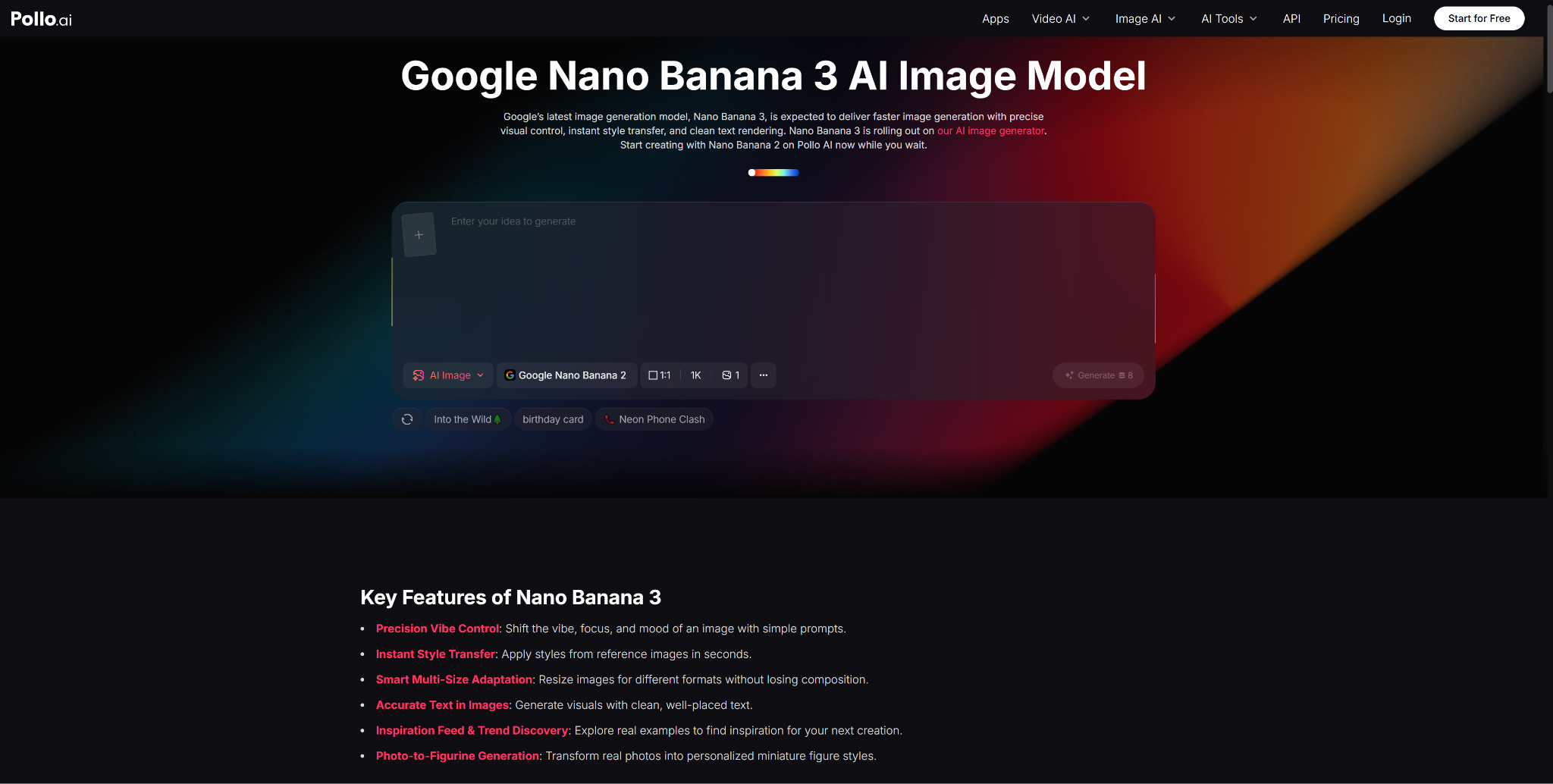
These are the failure modes that matter for presentation contexts, and they’re the ones that Pollo AI’s Nano Banana 3 is best positioned to help with—given its specific strengths in text rendering, control, and output fidelity.
Top Use #1: Turn Ideas Into Diagrams, Concept Visuals, and Branded Slides
This is the most immediate application, and the one where the model’s text rendering capability is most directly relevant.
Use Readable Text Where Screenshots Would Fail
A common workaround for presentation visuals is to screenshot something—a website, a tool, a data dashboard—and drop it into a slide. The problem is that screenshots rarely have the right visual treatment, framing, or cleanliness for a presentation context. Nano Banana 3 lets you generate the concept from scratch, with readable labels, in a composition that works for the slide—rather than screenshotting something that only approximately fits.
For concept diagrams, process flows, architectural overviews, and comparison visuals, this is a meaningful upgrade. You’re not constrained by what already exists in screenshot form; you can generate the exact visual explanation you need.
Keep the Visual System Consistent Across Outputs
Google’s official announcement highlights Nano Banana Pro’s improved control for “consistent brand” and “high-fidelity visuals.” For presentation work, this means you can establish a visual system—color palette, layout conventions, label style, background treatment—and carry it across every asset in the deck. A ten-slide presentation where every visual looks like it belongs to the same family is more persuasive than ten strong individual images that don’t relate to each other.
Top Use #2: Use Pollo AI to Test and Refine Visual Directions Quickly
The bottleneck in presentation design is rarely execution—it’s decisions. Teams often spend more time debating visual directions than they do producing the actual assets. Being able to quickly generate multiple interpretations of a visual concept, review them together, and make a call without waiting for a designer to produce each option is where AI image generation earns its keep in presentation workflows.
Helpful for Marketers, Founders, and Internal Teams
Pollo AI gives marketers, founders, and team leads direct access to Nano Banana 3’s capabilities in an interface that doesn’t require technical setup. For someone preparing a sales pitch or an investor presentation on a short deadline, the ability to generate, compare, and select among visual directions in the same session dramatically compresses the pre-production phase.
Why Usability Matters as Much as Image Quality
A model that produces slightly lower-quality outputs but is fast and easy to iterate with will outperform a higher-quality model that requires thirty minutes of setup for every prompt adjustment. For presentation workflows—where the visual brief changes as the narrative evolves—iteration speed is a core feature, not a secondary concern. Pollo AI’s accessible interface addresses exactly this tradeoff.
Top Use #3: Add Animated Presentation Logic Only When It Improves Communication
There’s a common temptation in presentations to animate everything. Motion can signal sophistication, but it can also obscure clarity. The practical rule: add animation when it improves understanding, not when it improves impressiveness.
Where Powtoon Fits Naturally
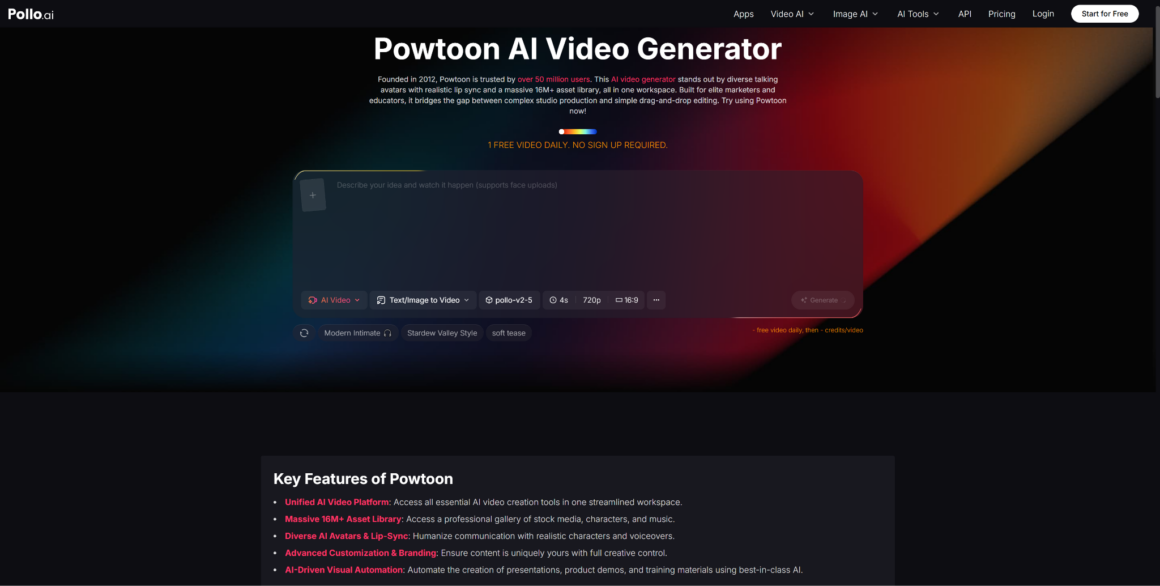
For onboarding sequences, product walkthroughs, or training content where the message needs to unfold over time, tools like Powtoon offer a structured animation format that’s built for presentations rather than raw motion. The combination that works well: use Nano Banana 3 to generate the high-fidelity visual assets, then bring them into a presentation animation tool for sequences that benefit from progressive reveal, narration, or character-led explanation.
This is a complementary workflow, not a competitive one. Static AI-generated visuals and sequenced presentation animation serve different communication needs—the skill is knowing which to reach for.
Turning Static AI Visuals Into Lightweight Presentation Stories
A practical application: generate five to eight hero images for the key narrative moments in a presentation using Nano Banana 3 in Pollo AI, then use those images as the visual anchors in an animated sequence. This approach keeps the production time low while ensuring the visual quality is consistent and controlled—rather than relying entirely on template-based assets that may not match the brand or message.
Top Use #4: Balance Visual Quality With Trust and Compliance
Google’s own materials note that Nano Banana Pro outputs carry SynthID watermarks—an embedded provenance signal that allows the image’s AI origin to be identified. For presentation contexts in regulated industries, investor communications, or external-facing materials, this is worth understanding.
Content accuracy is a shared responsibility. Any factual claim, label, or data visualization in an AI-generated presentation asset needs to be verified by a human before the presentation is delivered. AI models don’t check facts—they generate plausible visuals. The persuasive quality of AI-generated images makes this more important, not less.
Legibility across delivery formats. Presentation assets need to work in multiple contexts: on-screen in a conference room, as a PDF attachment, as individual image exports for follow-up communications. Test outputs at multiple sizes and formats before finalizing.
Provenance transparency. In contexts where AI use should be disclosed—press materials, regulatory submissions, competitive sourcing situations—know that your assets may carry SynthID signals, and plan your disclosure accordingly.
Final Recommendation
The strongest presentation workflow using Nano Banana 3 isn’t about replacing your design process—it’s about compressing the expensive early phase where ideas become concrete visuals. When a team can generate a concept diagram, a comparison visual, or a branded graphic quickly and iteratively, the decisions that shape the final presentation happen faster and with more concrete information.
Pollo AI is the access point that makes this iterative process practical for non-technical users. The animation layer—via tools built for presentation sequencing—adds motion only where it genuinely serves the communication.
Focus on the use cases where readable text and visual clarity matter most. Build prompt patterns around your brand system. Treat the animated presentation layer as an enhancement, not a default. That combination will consistently produce more useful presentation assets than any single tool used in isolation.


